Web Design & E-commerce
Shackleton Website Design
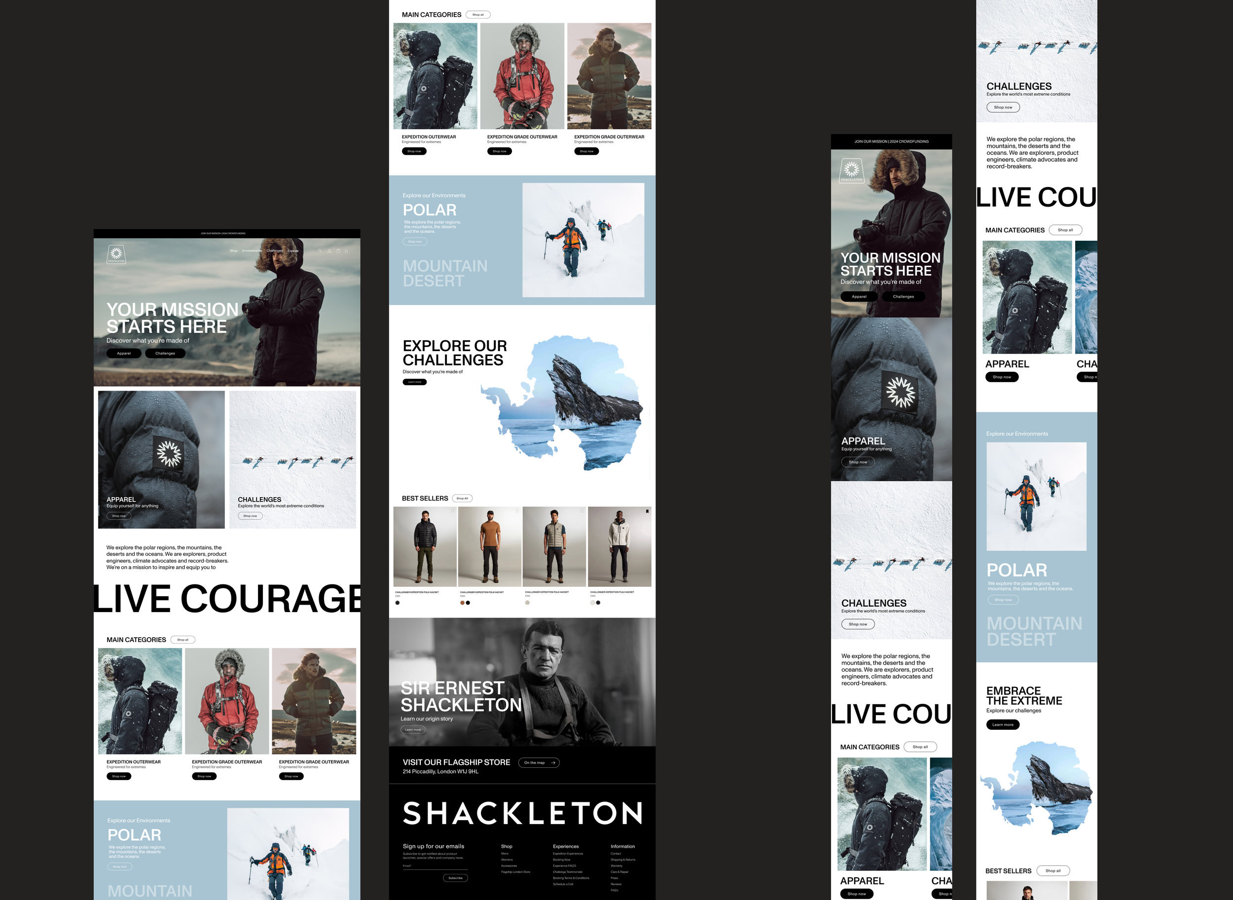
Led the redesign of Shackleton’s e-commerce experience, evolving the brand’s digital aesthetic into a more considered, premium expression aligned with its positioning.
-
The redesign focused on building a clear and consistent visual system across the entire site - bringing structure, hierarchy, and refinement to the experience.
Key areas of focus
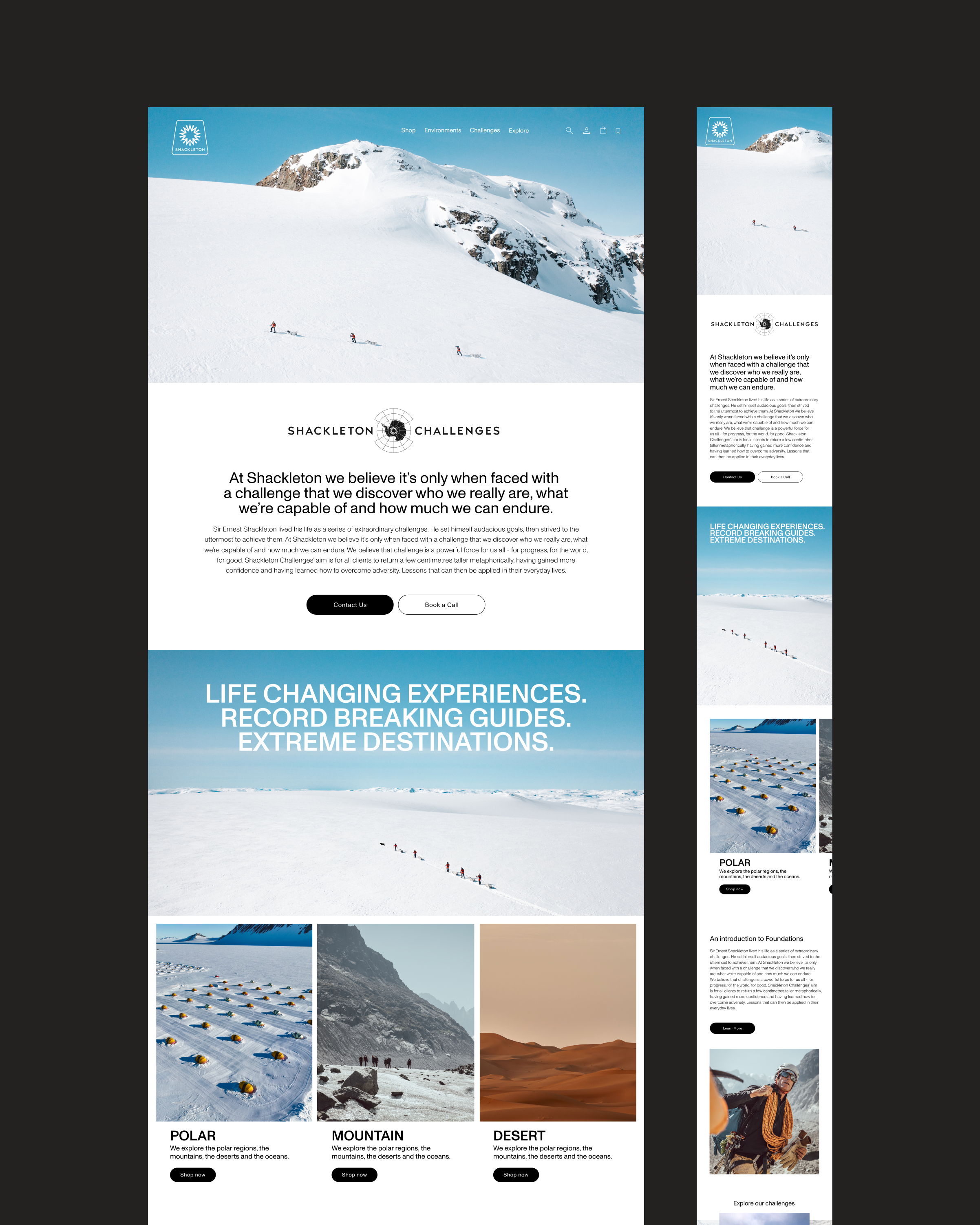
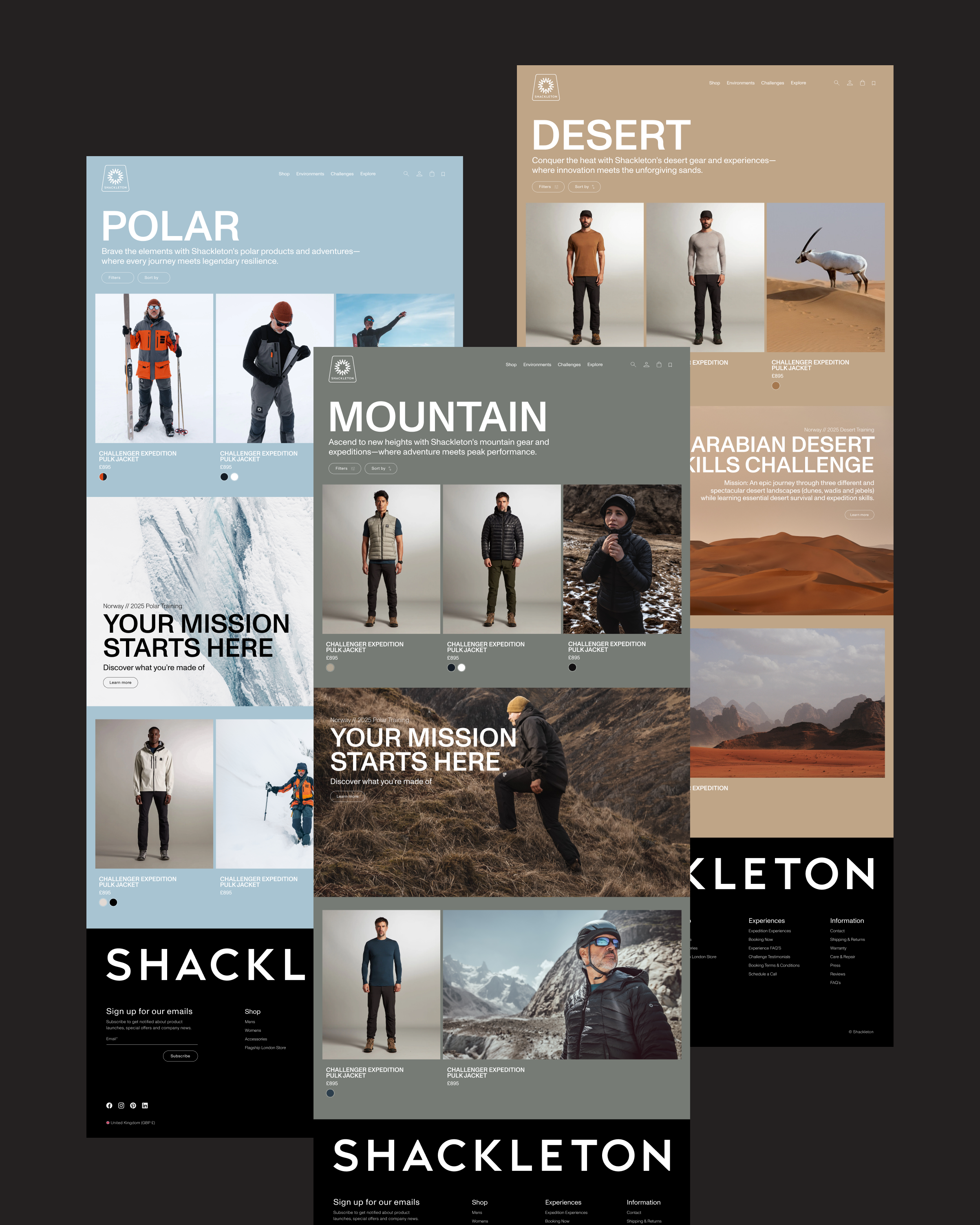
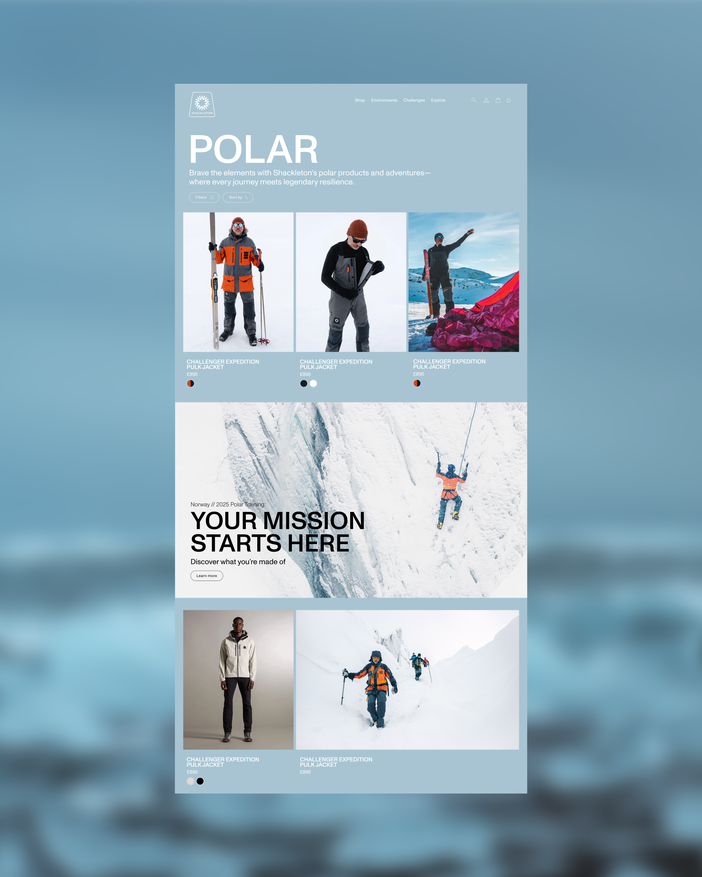
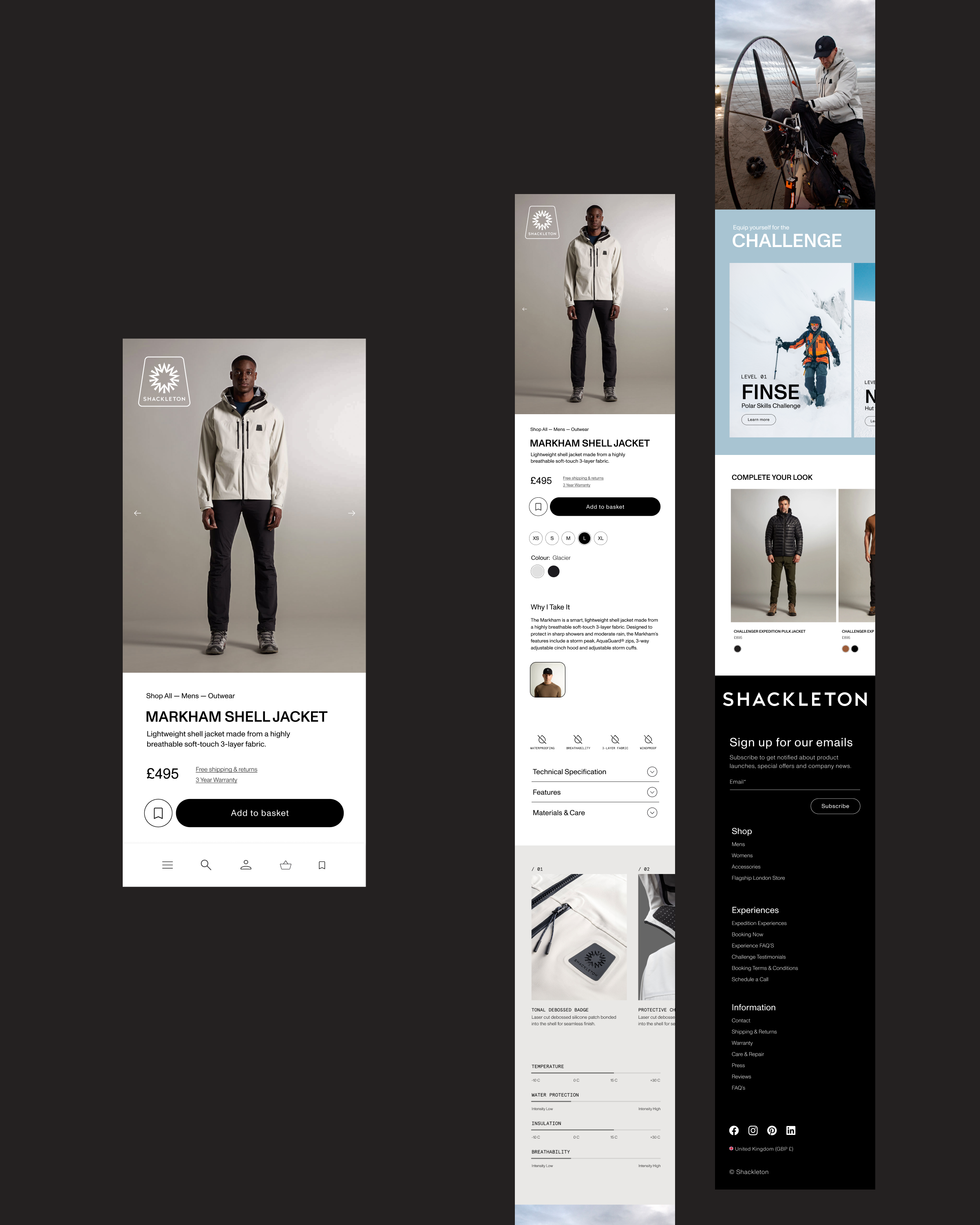
Establishing a more premium, editorial aesthetic
Creating consistency across all page templates
Improving navigation and user flow
Integrating storytelling (Challenges) more seamlessly into the e-commerce journey
-
The existing website lacked consistency across key touchpoints and didn’t fully reflect the premium nature of the brand.
Visual language felt fragmented across pages
Limited cohesion between product and storytelling content
Opportunities to improve navigation and overall usability
The “Challenges” offering lacked clarity within the wider site structure
The goal was to create a more unified, elevated experience that balanced storytelling with a seamless path to purchase.
-
The design direction centred around restraint, clarity, and hierarchy, allowing the product and brand narrative to lead.
Typography: Clean, structured, and highly legible to support both commerce and editorial content
Layout: Grid-based systems to ensure consistency and scalability
Imagery: Large-format, immersive visuals to reinforce brand storytelling
Hierarchy: Clear distinction between product, content, and navigation layers
The intention was to create a system that feels both functional and considered, equally suited to exploration and conversion.
-
The redesigned experience delivers a more cohesive and elevated digital presence for Shackleton.
Stronger alignment between brand and digital execution
Improved usability across key journeys
A clearer, more integrated storytelling layer
A scalable design system for future growth